Two Steps to Transforming a Room
After months of waiting, I finally have the keys to my very own home. To be honest, I'd felt more overwhelmed than excited at the prospect of transforming a pretty outdated space into something beautiful. With a couple of changes, though, this space has become a place that feels like home and really reflects my style.I plan to reveal more of my home as things evolve, but here's a first look at my dining room. I still need to add artwork and maybe two contrasting chairs to the table, but I'm so happy with how it looks.Here are some before photos: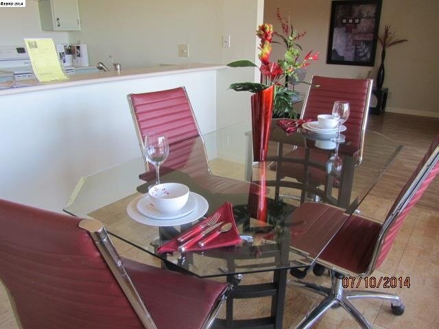 {view from dining room towards the living room, in its fully staged glory}
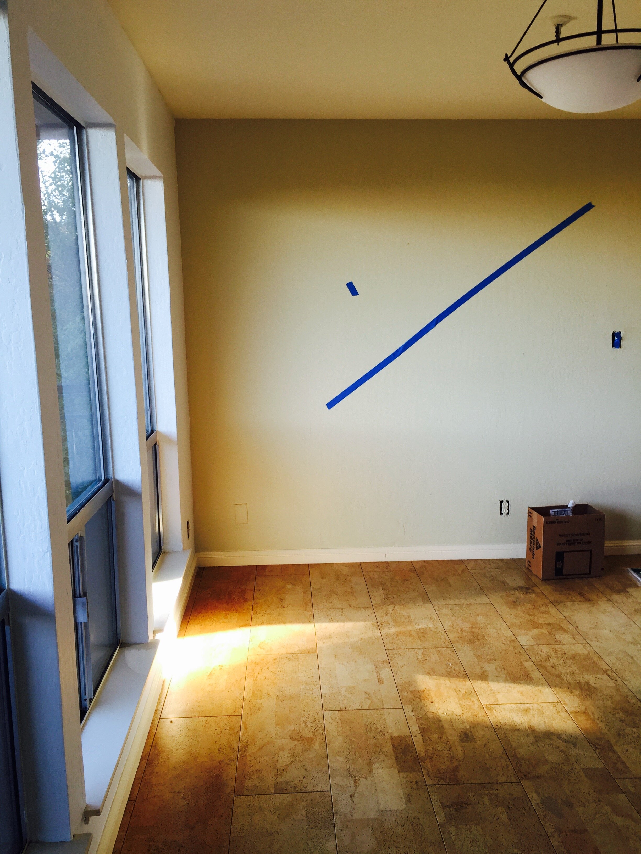 {view from living room towards the dining room, prepped for paint}
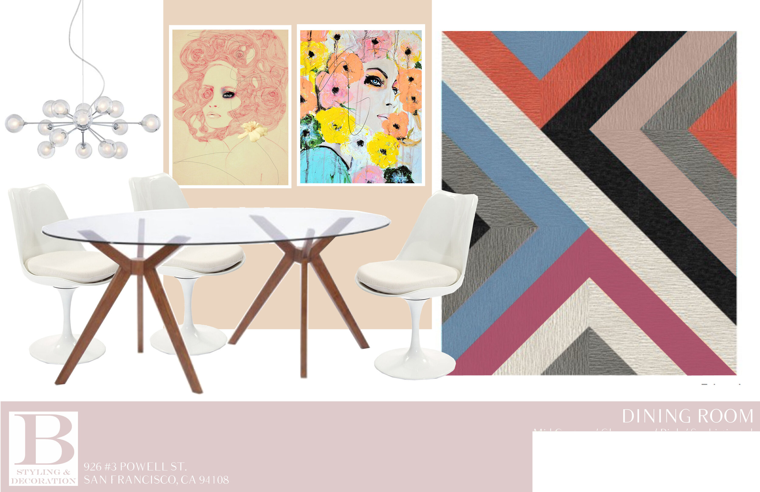
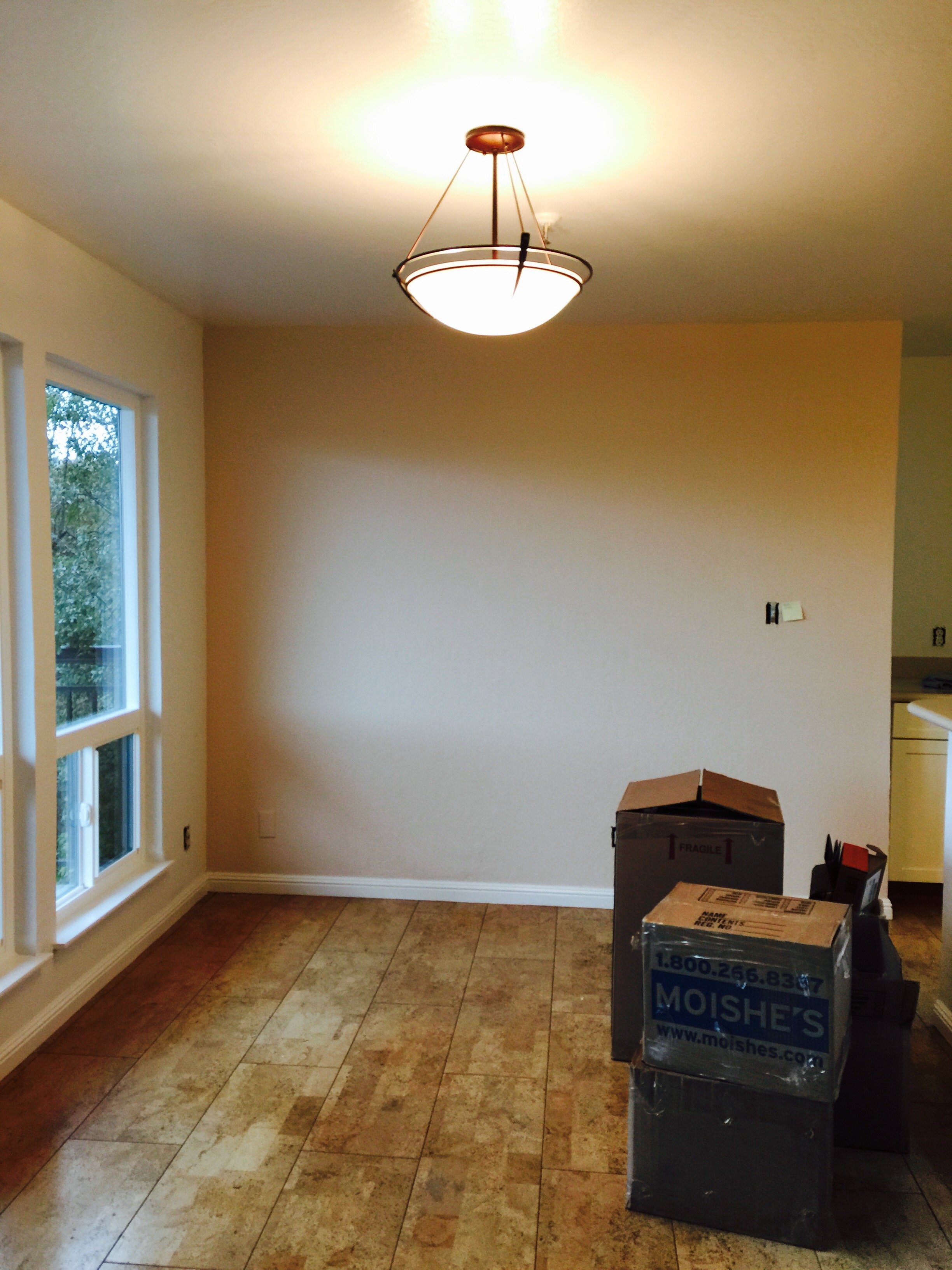 {post paint and new windows, but before the new light fixture}The dining room space is great, with lots of natural light thanks to the nearly floor to ceiling windows and sliding glass door, but the walls were painted a drab gray/green and the light fixture was pretty obtrusive and dated.Here's the inspiration:
 And here's how it looks so far:
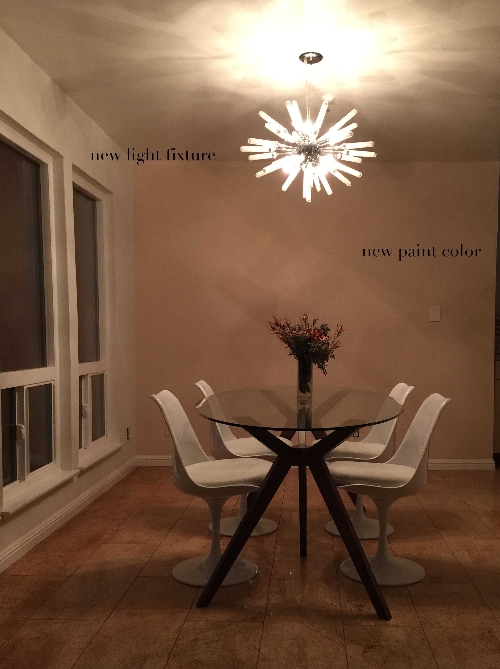 At the suggestion of some awesome designers that I'm working with, I painted the walls, ceiling and trim in Steam by Benjamin Moore, a neutral white. Then, for the accent wall, I used Inner Peach, also by Benjamin Moore.The light fixture is a sputnik-style that I've been obsessing over for years, and I'm thrilled that I found this at a great price ($200!) at Lamps Plus last weekend. I still need to add a rug because I'm not too excited about the cork flooring, eco-friendly as it may be. The wall is screaming for some dramatic art work, but I smile every time I see this room.If you have any questions about sources, ask me in the comment section.